Android 16 Developer Preview 1 (DP1) brings a host of visual updates, including a refreshed Wi-Fi sharing menu. This subtle yet impactful change highlights Google’s commitment to refining the user experience with Material You design language.
What’s New in the Android 16 DP1 Wi-Fi Sharing QR Code Design?
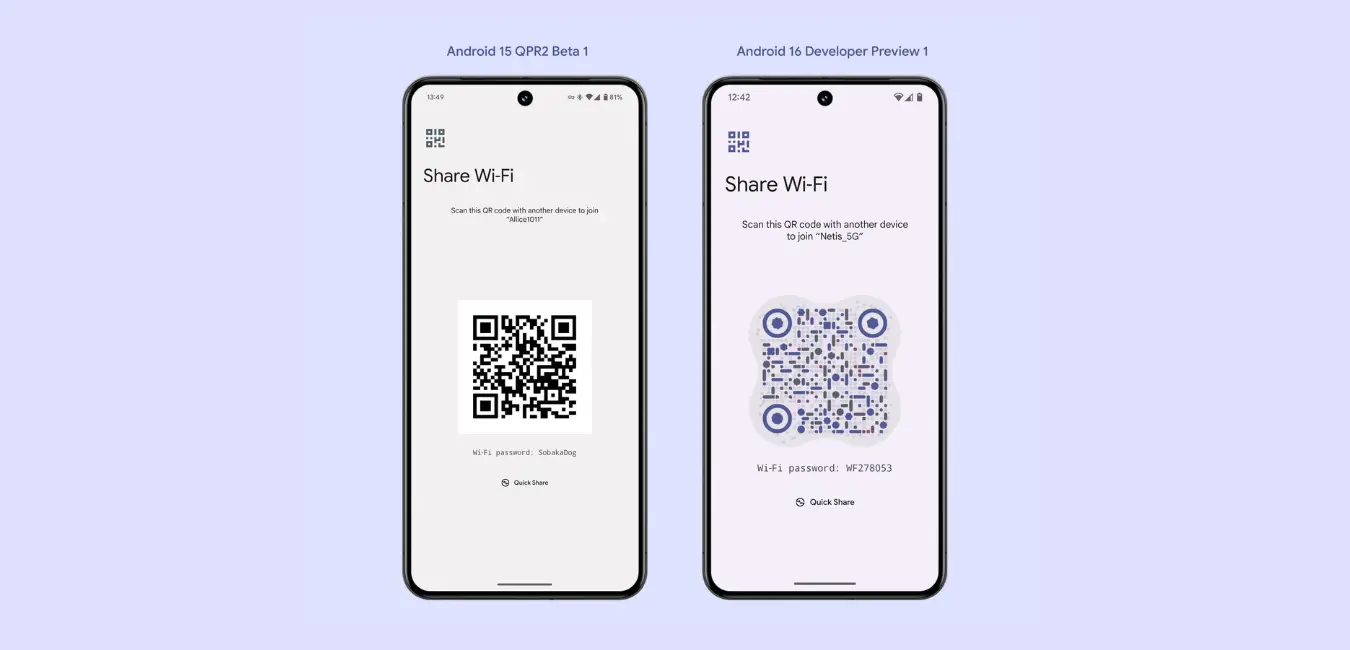
The Wi-Fi sharing menu has been revamped to align with the Material You aesthetic, offering a more modern and cohesive look. Here’s what’s changed:
Android 16 DP1 Dynamic Colors Integration
The new QR code design adopts the dynamic color system introduced with Material You. The QR code and its surrounding interface now adapt to the user’s wallpaper, creating a seamless and personalized visual experience.
Enhanced QR Code Appearance Animation
A subtle yet engaging animation greets users when they open the Wi-Fi sharing page. This small detail adds a layer of polish to the user interface, making the experience feel smoother and more interactive.
Why This Matters
While the functionality of sharing Wi-Fi credentials via QR code remains unchanged, the updated design reflects Android’s shift toward unifying aesthetics and usability. By leveraging dynamic theming, Google ensures every interaction feels unique and aligned with the user’s preferences.
Conclusion: A Step Toward a More Polished Android
The redesigned Wi-Fi share QR code in Android 16 DP1 might seem minor, but it exemplifies Google’s focus on enhanced usability and aesthetics. As Android 16 evolves, users can expect even more refined experiences that prioritize both functionality and design.
What do you think of the new design? Let us know your thoughts!
